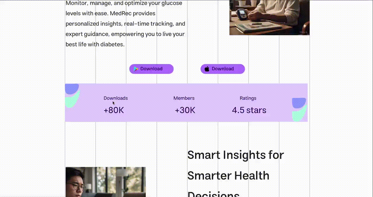
MedRec
I set out to design a diabetes management app that would bring clarity, calm, and control to users navigating a complex, emotionally demanding health journey.
The Challenge
Managing diabetes is a lifelong responsibility that requires constant vigilance: glucose logging, meal tracking, medication management, and exercise monitoring.
In healthcare tech, usability directly impacts patient retention, daily active use, and reduced support costs.
Design an interface that feels supportive rather than burdensome, turning a daily chore into a moment of self-care while reducing error rates and improving task efficiency across three platforms.
My Contributions
Research
Design
Validation
How I Made an Impact
Framing the Problem
Identified that users weren't overwhelmed by diabetes—they were overwhelmed by fragmented tools. Reframed the challenge from "more features" to "unified experience."
Designing for Motivation
Shifted from clinical data dumps to supportive guidance. Progress celebrations and gentle nudges replaced harsh alerts and judgmental metrics.
Simplifying Complexity
Reduced 12+ daily manual inputs to 3-4 through CGM and smartwatch integration. Progressive disclosure reveals features only when users are ready.
Building Visual Trust
Created calm, accessible interfaces that feel like a supportive companion rather than a medical device. Color psychology and typography choices reinforce emotional safety.
Understanding the Users
I conducted user interviews, surveys, and analyzed in-app analytics to understand who our users were and what they truly needed. Three distinct personas emerged to guide design decisions:

Sarah
Newly Diagnosed · Age 34Recently diagnosed with Type 2 diabetes. Feeling anxious and overwhelmed by the lifestyle changes ahead.
Learn diabetes basics without feeling overwhelmed or judged
- Step-by-step guidance
- Simple visual trends
- Reassurance and positive reinforcement
- Medical jargon
- Complex data visualizations
- Apps that feel clinical and cold

Davis
Long-term Manager · Age 67Managing Type 2 diabetes for 15+ years. Values independence but finds new technology intimidating.
Maintain independence and avoid complexity
- Intuitive interface
- Minimal steps
- Large text and clear icons
- Automated logging
- Small touch targets
- Too many screens to navigate
- Features he'll never use

Zack
Tech-Savvy Teen · Age 16Type 1 diabetic since age 8. Wants technology that fits his active, social lifestyle.
Use technology to maintain health without feeling different
- Smartwatch integration
- Gamified engagement
- Discreet alerts
- Social sharing options
- Outdated app designs
- No smartwatch support
- Apps that make diabetes his identity
Wireframing & Iteration
I followed a three-stage fidelity approach to iterate quickly while validating assumptions at each stage:
Low-Fidelity
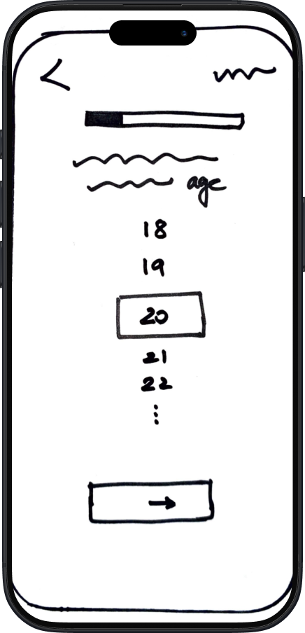
Fast sketching to explore layout options and core navigation structure.
Mid-Fidelity
Grayscale wireframes built in Figma to test flow without visual distraction.
High-Fidelity
Polished UI with colors, icons, and realistic content.
Key Learnings from Wireframing
Early sketches helped us eliminate a cluttered onboarding flow before investing in code.
Mid-fidelity testing revealed that users preferred a bottom nav over a hamburger menu.
High-fidelity prototypes validated that calming colors reduced reported anxiety during glucose tracking.
Iterating on micro-interactions early helped us prioritize meaningful feedback over flashy animations.
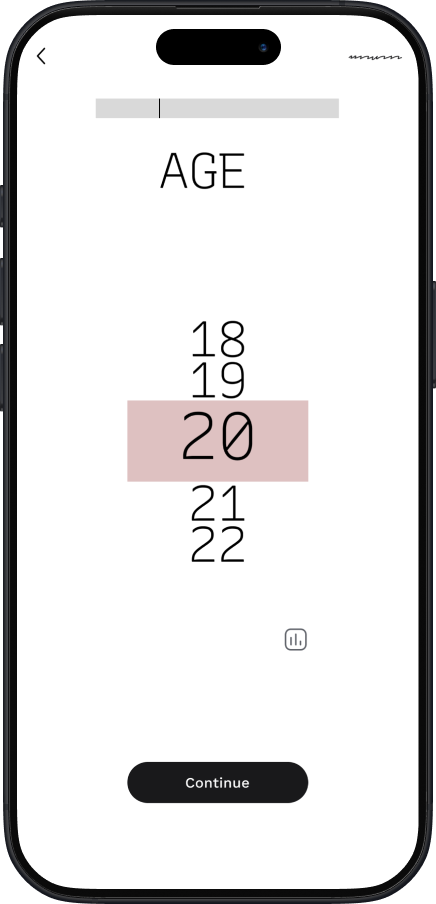
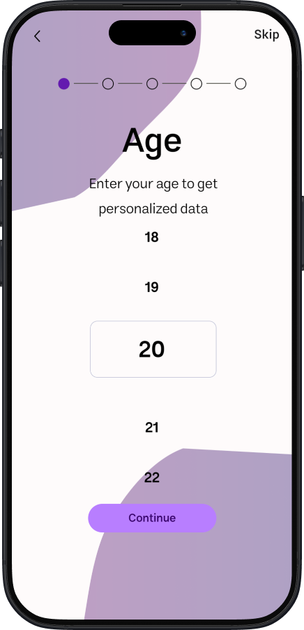
Design Evolution
Key screens evolved significantly through iteration and user feedback. Drag the slider to compare before and after:
Mobile App

Reduced cognitive load by consolidating 12+ visible metrics into progressive disclosure patterns.
Web Dashboard
Transformed clinical data dumps into intuitive visualizations with exportable reports.
Smartwatch

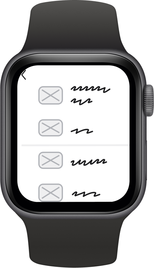
Optimized for at-a-glance information with haptic feedback for critical alerts.
Usability Testing
Usability testing with 6 potential users across all three personas revealed critical issues that shaped the final design:
Users couldn't find date navigation—icon was too small and unlabeled
Increased icon size by 40% and added "History" label below
Tutorial screens needed explicit cues for navigation
Added progress dots, gesture hints, and "Swipe to continue" text
Home screen cards were confused with tappable buttons
Refined visual hierarchy—cards now have subtle depth, buttons have clear affordances
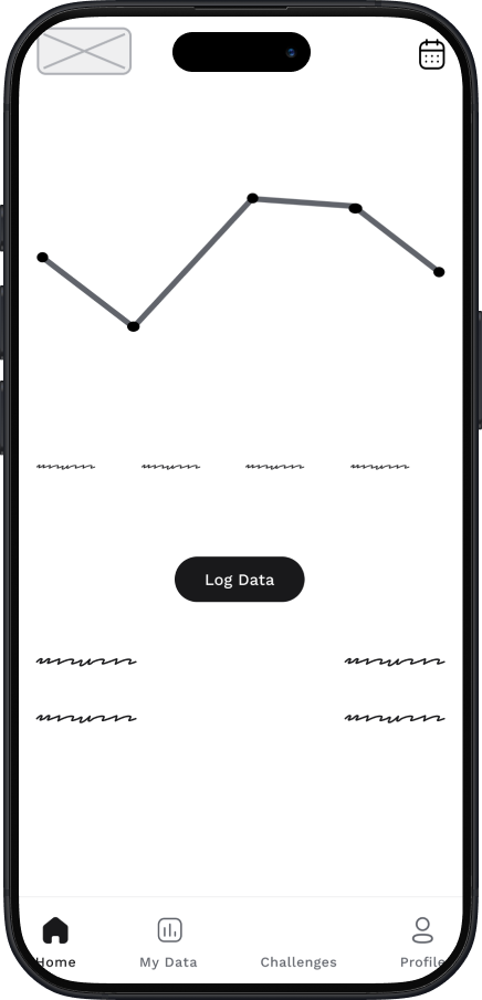
Deliverables
The final design system spans three platforms with consistent visual language and interaction patterns:
Mobile App
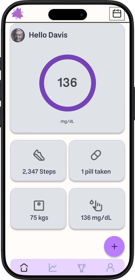
Daily Overview
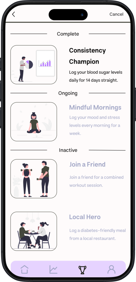
Challenges
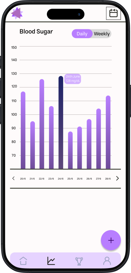
Progress Trends
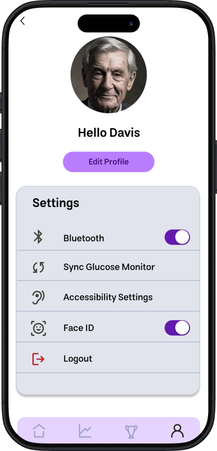
Preferences
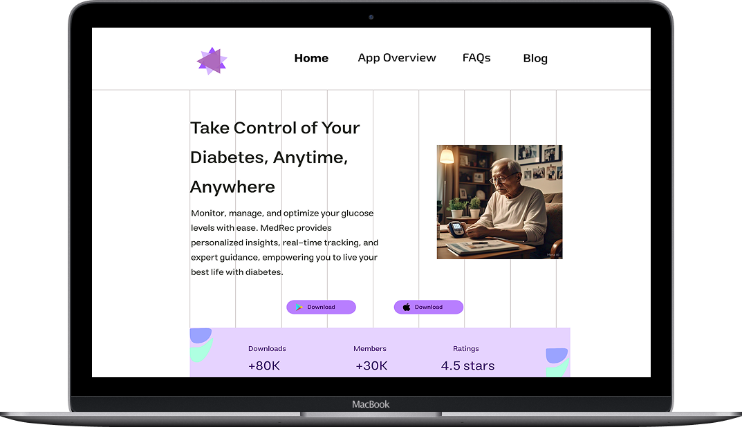
Web Dashboard
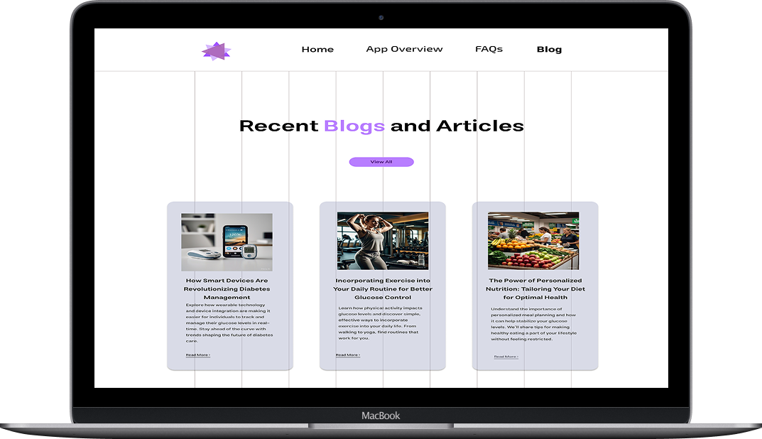
Blog page for health tips and community updates
Smartwatch
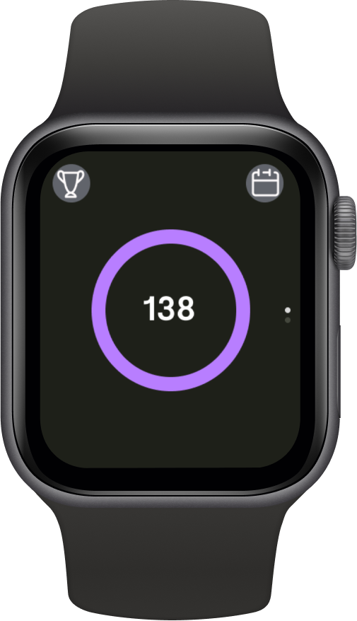
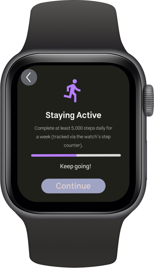
Watch Face
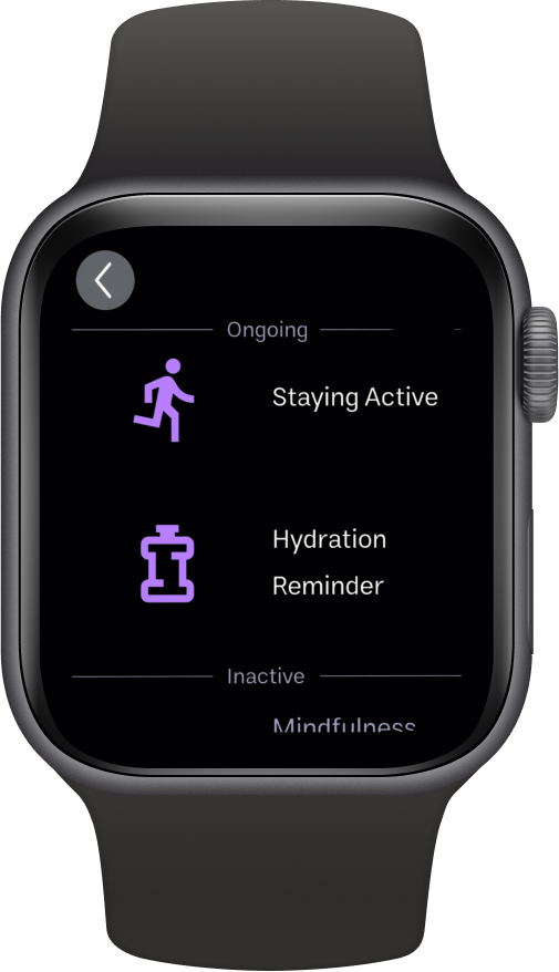
Goals

Progress
Design Philosophy
Three core principles guided every design decision:
Calm Visuals
Soft color palette with purposeful accent colors. White space creates breathing room. Animations are subtle and never jarring.
Accessibility First
WCAG 2.1 AA compliance. High contrast ratios, scalable text, touch targets exceeding 44px, screen reader optimization.
Empathy in Tone
Copy avoids medical jargon and judgment. Celebrates small wins. Acknowledges the emotional weight of daily management.
Visual Direction
The visual system was designed to feel calming and supportive—never clinical or alarming.
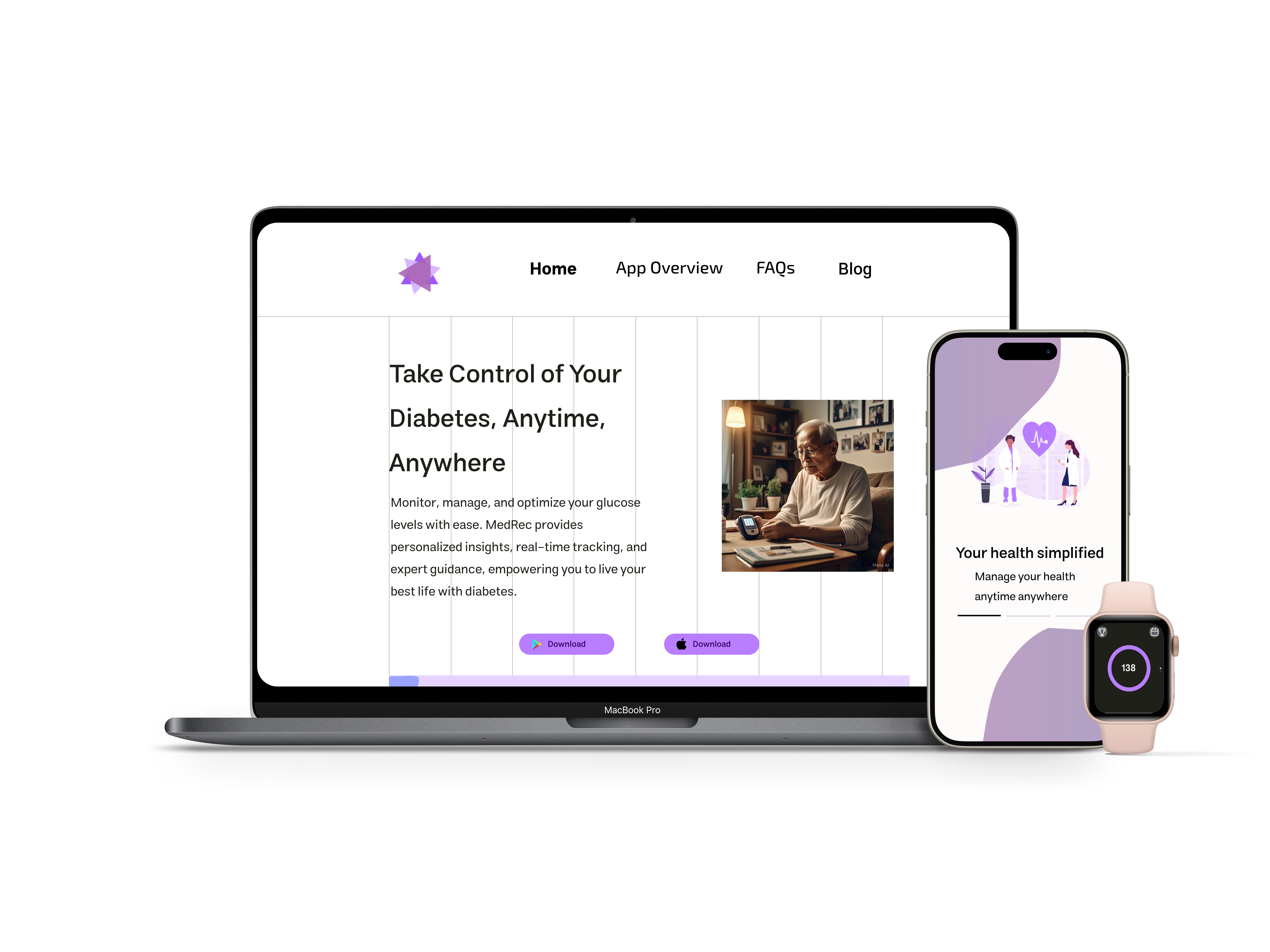
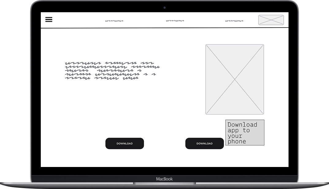
Website Experience
The web dashboard provides caregivers and healthcare providers with comprehensive insights, exportable reports, and long-term trend analysis—all accessible from any browser.
Conclusion & Learnings
"Designing for healthcare goes beyond usability—it's about addressing the emotional weight users carry every day."
Emotional needs come first
Healthcare design requires understanding feelings before features. Users need to feel supported, not surveilled.
Progressive disclosure prevents overwhelm
Start simple, reveal complexity gradually. Power users get depth; beginners get clarity.
Cross-platform consistency builds trust
When the mobile, web, and watch experiences feel unified, users feel confident in the entire ecosystem.
Test early, test often
Every assumption I had was challenged by real users. The best designs emerged from listening, not guessing.
What This Shows About Me
This project shows that I can take a deeply personal, emotionally-charged topic and translate it into a design that's both functional and human.
Empathy-Driven Design
I approach health tech with sensitivity, understanding that users aren't just completing tasks—they're managing their lives.
End-to-End Ownership
From research to final UI, I led the full design process, ensuring consistency and intentionality at every step.
Design System Expertise
I built scalable, accessible components that can grow with the product and serve as a foundation for future features.
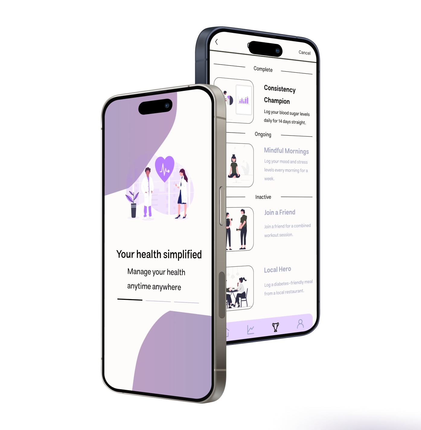
Mobile App in Action
See how the mobile app brings together glucose tracking, medication reminders, and progress insights into a seamless daily experience.